
Wall paint colors can shift more than expected once they move from a chip to a real room in Erie. Window direction, light reflectance, nearby finishes, and the color of adjacent rooms all affect how a shade reads once it covers a full wall.
A better way to choose is to treat color as part of the whole room, not as a standalone sample. Start with light and fixed finishes, compare LRV and undertones, then test finalists where you will actually live with them.
Use Room Direction as Your First Filter
North-, south-, east-, and west-facing rooms receive different light at different times of day. That changes which undertones become more noticeable and how light or dark a color feels once it is on the wall.
North-facing rooms usually receive cooler indirect light, while south-facing rooms tend to receive warmer, steadier daylight. East-facing rooms shift from warmer morning light to cooler later light, and west-facing rooms become warmer late in the day.
Instead of asking which color is best for Erie in general, start by asking which direction the room faces and how much daylight it actually receives.
Use LRV to Compare Colors That Are Close
Light Reflectance Value, or LRV, tells you how much light a color reflects. Sherwin-Williams uses a scale from zero to 100, with higher values reflecting more light.
Sherwin-Williams’ room-orientation guide recommends considering LRV alongside room direction rather than treating every neutral the same.
LRV does not tell you if a color is warm, cool, or right for your flooring, but it helps explain why two similar-looking samples can make a room feel very different.
Let Fixed Finishes Eliminate the Wrong Undertones
Flooring, cabinetry, countertops, stone, tile, and trim are often more expensive to change than wall color. Use those fixed finishes to narrow the palette before you start comparing dozens of paint chips.
A warm floor may make one gray look unexpectedly blue, while a red-toned cabinet can make a beige look more pink than it did in the store. Those shifts are not defects in the paint. They are part of how surrounding colors affect what you see.
Choose finalists that work with the materials staying in the room, then compare those shades under the actual light.
Use 2026 Color Trends as a Shortlist, Not a Rule
The 2026 brand selections do not point to one single look. Sherwin-Williams chose Universal Khaki SW 6150, a warm mid-tone neutral with a slight yellow undertone.
Benjamin Moore selected Silhouette AF-655, a much deeper espresso and charcoal color. Its broader 2026 palette also includes pale neutrals, green, tan, blush, and pottery-inspired tones.
That range is useful because it shows that current color direction can support both quiet backgrounds and deeper statement walls. Your room still decides which end of that range makes sense.
Plan Color Flow Between Rooms Before Painting One Wall
Open floor plans, hallways, stairwells, and wide doorways make adjacent colors part of the same view. A wall color can work beautifully by itself and still clash with the room beside it.
Carry paint samples to the transition points between spaces. Compare the new wall color with the nearby trim and with any existing paint that will stay.
If you want stronger color in one room, a calmer connecting color can help the home feel intentional instead of chopped into unrelated sections.
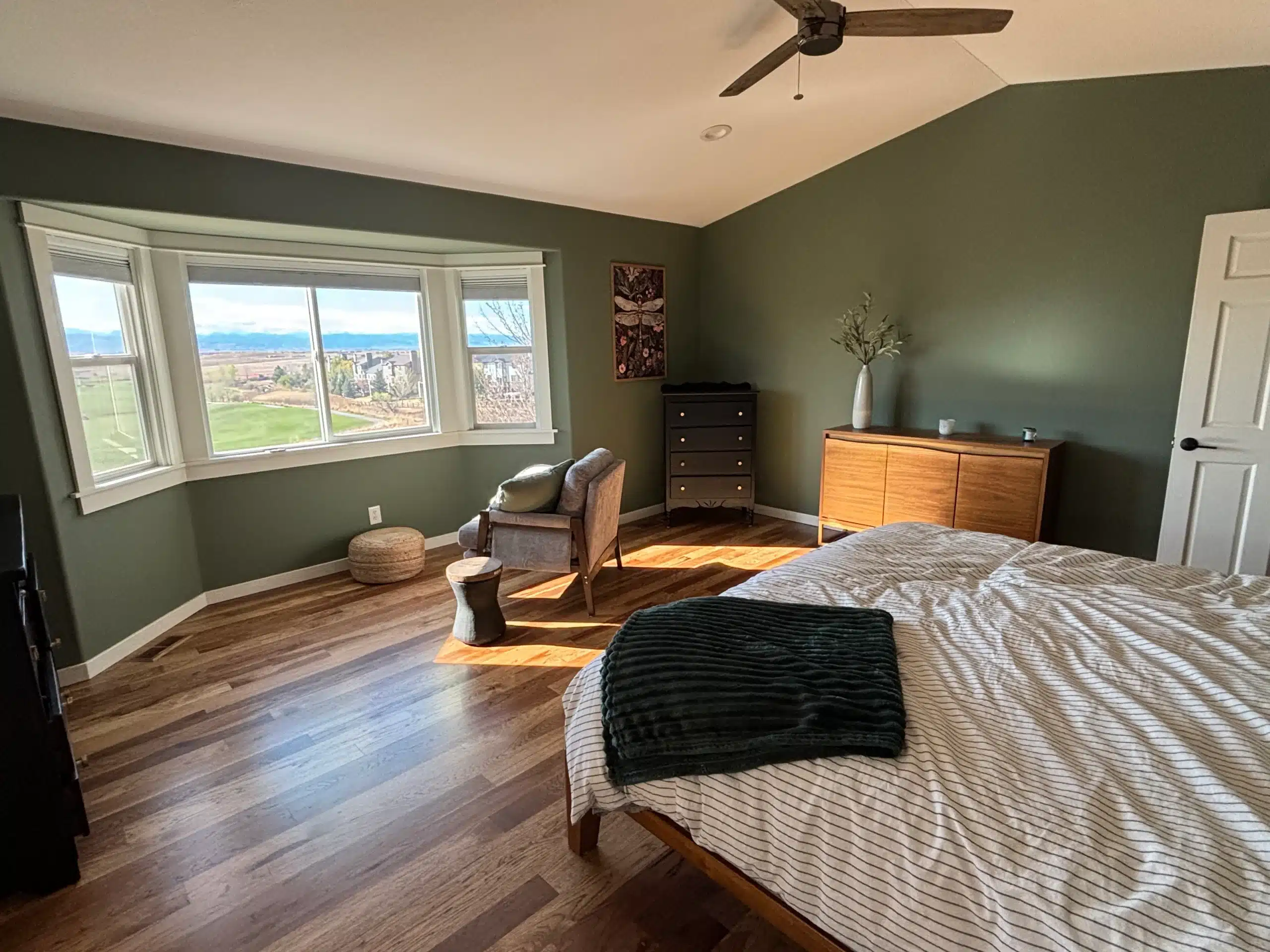
Test Finalists Where the Light Actually Changes
Do not test one small swatch beside the window and call it finished. Put your finalists on more than one wall or use movable sample sheets so you can compare them in different parts of the room.
Check the samples during the morning, midday, late afternoon, and under the lights you normally use at night. The goal is not to find a color that looks identical all day. It is to find one whose changes you still like.
Keep the sample beside the flooring, furniture, or cabinets that will remain so the test reflects the finished room.
Choose Sheen After You Choose the Color
Sheen changes how much light reflects from the painted surface. That means the same color can look softer in a lower-sheen finish and more reflective in a higher-sheen finish.
The right choice depends on the exact coating, wall condition, room use, and cleaning needs. A rigid rule that every bedroom or hallway needs one specific sheen can oversimplify the decision.
If you are comparing finishes, our guide to eggshell and semi-gloss paint explains the practical differences.
Use Real Project Conditions to Make the Final Call
Color decisions get easier when they are tied to the actual project. A room with repaired drywall, newly painted cabinets, fresh trim, or a different ceiling color may need to be judged after those surfaces are part of the plan.
A recent A New View Painting project in Erie Village paired Sherwin-Williams Alabaster with Waterloo and Dried Thyme after the homeowners wanted a lighter interior with selected bold accents. The colors were planned around the existing home and the specific surfaces being repainted.
That is a better model than choosing a trend color first and forcing the rest of the room to work around it.
How A New View Painting Helps Erie Homeowners Choose
A New View Painting is based in Erie and serves Erie, Broomfield, Lafayette, Louisville, Boulder, Frederick, Longmont, Westminster, and surrounding Northern Colorado communities.
The company was founded in 2008 and has completed more than 5,000 projects. Its current process includes an on-site consultation, surface evaluation, discussion of colors and finishes, identification of prep work, premium coatings, free estimates, and a 2-year interior warranty.
A New View Painting is locally owned and operated, fully insured, PCA accredited, and a Google Guaranteed service provider. For the full service, see our interior painting services.
Frequently Asked Questions
What does LRV mean when choosing wall paint colors?
LRV measures how much light a paint color reflects. Higher values reflect more light, but undertone, room direction, and surrounding finishes still affect how the color looks.
Why does the same paint color look different on opposite walls?
Each wall can receive a different mix of direct light, reflected light, and artificial light. Nearby flooring, furniture, and trim can also shift how the color is perceived.
Should I use the same wall paint color throughout an open floor plan?
You can, but you do not have to. The better goal is a color flow that works across visible transitions, trim, flooring, and connected rooms.
Should I choose sheen before or after the paint color?
Choose the color family first, then compare the sheen options available in the exact product you plan to use. Reflectivity can change how the final color reads on the wall.